Posted On:
Innovative Web Design 2017

Here at Thunderbolt Digital, we like to keep up with as many innovative web design ideas as possible. Let’s talk about some of the best web design trends of 2016 that have followed us into the new year.
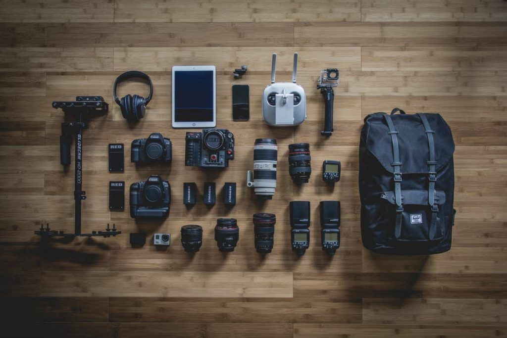
Strong Imagery
As web design evolves it’s becoming increasingly important to include high-quality images. As the old saying goes “An image says a thousand words” and if you can depict your point in one image, you are likely to get the attention of your audience a lot quicker.
Desktop Push Notifications
We all know how difficult it is to ignore those little pop-ups on your phone and now they’ve been introduced to your desktop. Desktop push notifications, as they’re called, are designed to keep you updated on content from news and content websites.
Typography
More and more websites are using wild and creative new fonts styles, or often using classic fonts in new and exciting ways. The use of different font sizes, colour and design have a huge impact on the look and organisation of a page.
Vibrant Colour Schemes
Gone are the days where people stuck to primary colours or having the odd drop of colour on a website. Now, people are using bright, lively colours throughout their entire sites. Using these new colour schemes adds that little extra to make the site as aesthetically pleasing as possible.
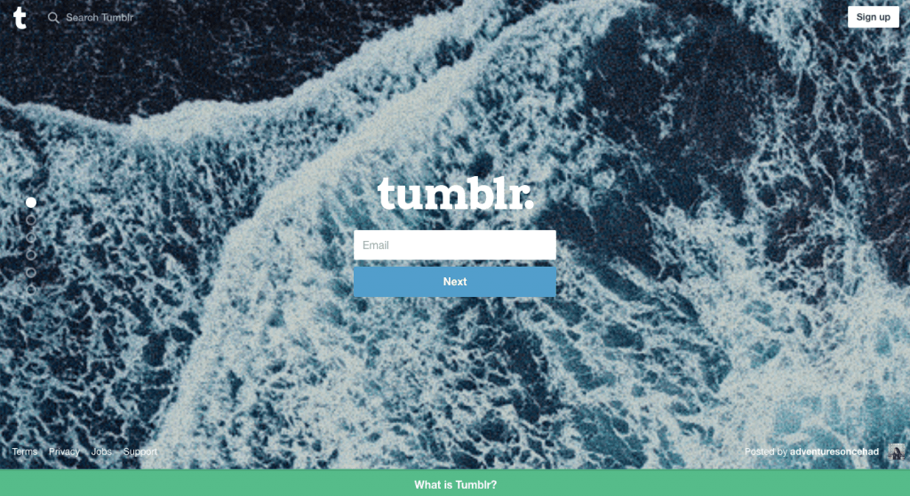
Full Screen Sign Up

Conventional pop-ups are finished, it’s possible full-screen takeovers will replace them. Instead of the typical “sign up” pop-ups websites are now using a full-screen pop up to grab you attention and persuade you to sign up. This has a much cleaner look rather than the small windows used. This is one of our favourite innovative web design trends!


