Posted On:
LinkedIn’s New Redesign

Here at Thunderbolt Digital, we like to keep up to date with all the latest news and are committed to always keeping you up to date too! Recently, LinkedIn has decided to redesign their website and we’d like to give you the first look…
LinkedIn is predominantly an employment-oriented social media site, and is therefore mainly used for business rather than pleasure. It enables professionals to network efficiently across the internet. As of September 2016, it has more than 467 million accounts and over 106 million active users, and it was rated 14th most popular website on Alexa Internet’s October 2016 ranking.
As you can tell from the figures above, millions of professionals have created accounts; however, in the past, several issues have been voiced in regards to the site’s user experience. In fact, Amy Parnell, the Senior Director of User Experience at LinkedIn, has even highlighted the fact that the most frequent user complaint they have historically received is that users, “weren’t sure what to do” on the site.
Therefore, an improvement to the user experience was a key factor for consideration when LinkedIn was undergoing a re-design. The re-design has not only improved the user journey, it has also made the website more visually pleasing, through a new sleek and modern interface. However, a few people have pointed out that the new LinkedIn design does bear a slight resemblance to some other social media sites…
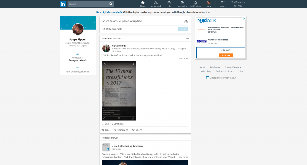
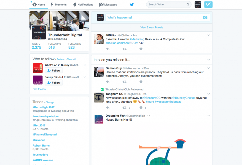
Firstly, as can be seen, there are now a number of similarities between Twitter and LinkedIn.
Both sites now have a similar homepage layout, with an identity box featuring your avatar and header image and showing a short introduction to your profile on the left-hand side of the page, while the newsfeed takes centre stage.
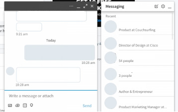
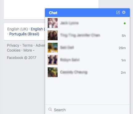
In addition to this, the new messaging feature on LinkedIn has an arguably familiar look, which some have likened to Facebook Messenger. Like Facebook, LinkedIn now has a small pop up in the bottom corner of the page, acting as a subtle encouragement to network with your connections.
Despite any similarities, we’d say that with this redesign, LinkedIn has managed to successfully keep its original features, as well as improving and modernising its look. This is incredibly important, as (like all businesses!) social media platforms need to constantly update themselves to keep up with and better their competition.
As a full-service digital agency, Thunderbolt Digital love keeping up with website design trends, whether these are relevant to social media platforms like LinkedIn, e-commerce websites, brochureware sites, or all of the above! If you’d like to find out more about recent industry trends, you can peruse the rest of our blogs here. Alternatively, if you’d like to chat to us about redesigning your own business’ website, just give us a call on 01252 413 757 or drop us an email at howdy@wearethunderbolt.com – one of our friendly staff members will be more than happy to help you.
