Posted On:
Case Study – Adam Heppenstall Web Design

Thunderbolt is a team of digital and online experts focused on giving their clients the best service. They recently set up a website for magician Adam Heppenstall using a parallax design; a design we mentioned in a previous blog as a popular web design trend for 2015.
About Adam Heppenstall
Showing off his tricks since he was 8, Adam recently took his show onto a cruise ship for a comedy magic performance. Adam is based in London and travels all over the Home Counties to perform his tricks at various bookings and gigs which include: Corporate Events, Weddings and Parties.

The Problem
Adam came to Thunderbolt believing we were the right team to redesign his website to make it easily found for clients and make it stand out against the competition. Adam wanted to be able to engage the user more easily with some clips from his previous gigs. The brief included information that the site should be present on Google for Magicians with details for the type of event and location.
The Solution
Thunderbolt, while sticking to the design brief, offered a new and inventive design trend for 2015. The Parallax web design makes for simpler user navigation. This is especially true for searching on mobiles and tablets; as it is quickly becoming apparent that users are taking to these devices for searching. The interactive web-graphic of this design we consider to be more engaging for customers and can increase the retention rate on websites like Adam’s.
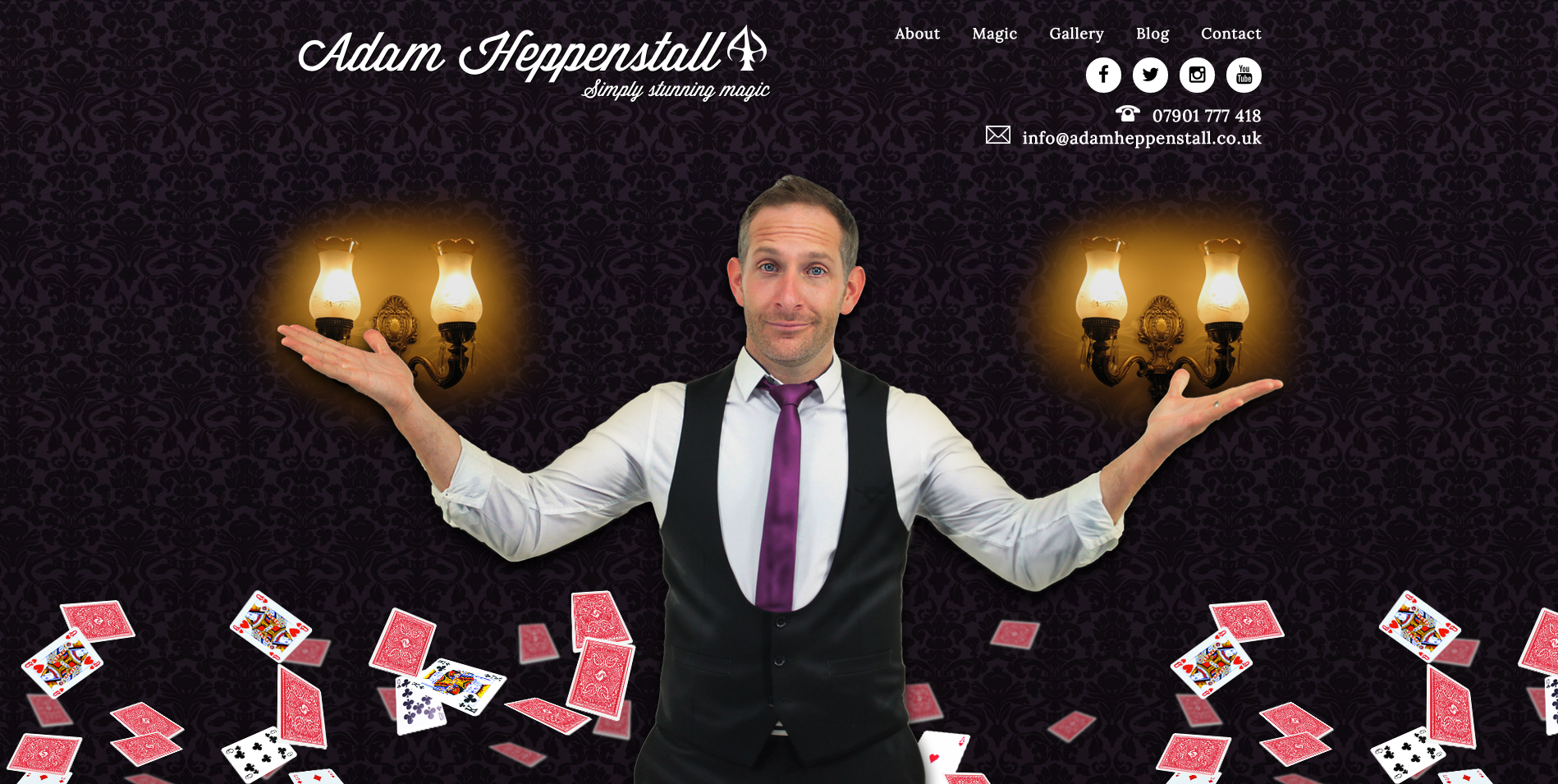
Furthermore the team at Thunderbolt added effective and interesting design elements. These include moving cards and flashing light bulbs in the background as you scroll down the page which emphasise the wonders of real magic. The close up image of Adam displays him as a perfect magician for any occasion to book him for.

The website is very easy to use and presents the high quality work and classy image that Adam wanted to portray. The gallery and the quotes prove this as either can be accessed by one click or less. The lilac and purple backgrounds compliment the fascinating type of work that he performs and it is clear the design team went above and beyond to ensure this could be properly portrayed.
The website also contains parts of Adam’s biography to give users an introduction to him. Importantly his website gives an ease of access to his various social media accounts which include Facebook, Twitter, Instagram and YouTube pages. This gives us an opportunity to see his further examples of his work and how we can follow him. Below that, on the home page, his contact details – phone and email – are included for bookings. This ensures that website is truly bespoke.
Both parties are very excited with the outcome of the final design of the website. Thunderbolt, while sticking to the design brief, offered a new and inventive web design trend which has proven to be not only popular, but also aesthetically pleasing, improving upon the user experience.